HIG
Sizes
The interface is designed to be scalable, so every component sizes are based on devices independent pixels (dp) which will scale accordingly to the device DPI and to user preferences.
most items use sizes predefined in the VLCStyle class.
It is possible to use custom sizing by using the metric VLCStyle.dp(42, VLCStyle.scale), it is required to pass the scale in the second argument to
keep the property binding on the interface scale.
Grid layout
Content should be horizontally aligned on a grid layout.
VLCStyle defines several metrics to help sizing your elements:
VLCStyle.column_widthis the width of a single columnVLCStyle.column_margin_widthis the empty space between two columnsVLCStyle.colWidth(n)gives the width for n columns accounting for inner margins.
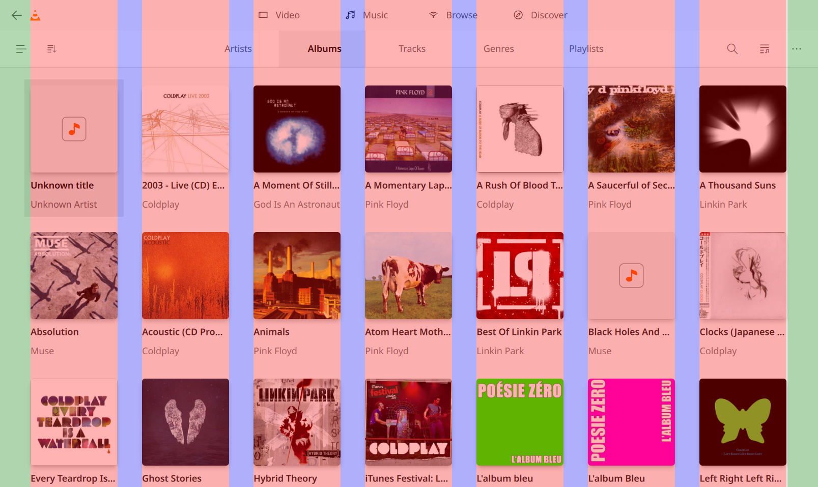
see material design grid system introduction 1
Safe area
The interface is primarily designed to be used as a standard desktop application, though the application has mechanisms to be used on a large screen (TV). We notably allow to pad the content of the application to fit in the safe area 2
No button, focusable element or texts should be in the unsafe area.
Elements presented as a list (vertically or horizontally) can extend to the unsafe area, but the currently selected element should remain in the safe area, beginning and end of the list can (should) overflow.
safe area can be tested by redefining in VLCStyle:
    readonly property int applicationHorizontalMargin: appWidth * 0.035
    readonly property int applicationVerticalMargin: appHeight * 0.035
Typography
VLC uses the system the default font to render text. This would typically be Segoe on Microsoft OS, and Noto or Ubuntu on Linux system.
VLCStyle defines a set of predefined font sizes to use in the application, you
can use fontSize_xxx (with xxx being xsmall, small, normal, xlarge, xxlarge,
xxxlarge). In order to vertically place your text, you can evaluate the required
place for the text with the matching fontHeight_xxx property
prefer using predefined text class according to your intent:
style |
size |
weight |
color |
class |
|---|---|---|---|---|
Subtitle |
xxxlarge |
Bold |
text |
Widgets.SubtitleLabel |
Menu |
large |
DemiBold |
text |
Widgets.MenuLabel |
List |
normal |
DemiBold |
text |
Widgets.ListLabel |
ListSubtitle |
normal |
DemiBold |
text(0.7 opacity) |
Widgets.ListSubtitleLabel |
Caption |
normal |
Normal |
caption |
Widgets.CaptionLabel |
MenuCaption |
normal |
Normal |
menucaption |
Widgets.MenuCaption |
Animation and transitions
Transitions duration timing should use the predefined values from VLCStyle
duration_veryShortshould be used for near instant transitionsduration_shortshould be used for short transitions (hovering an element, accuenting UI event)duration_longshould be used for longer transitions (opening or closing a pane, a dialogs)duration_veryLongshould be used for animations that requires a longer timing thanduration_longdelayToolTipAppearshould be used as a delay before a tooltip is displayed
Transition should uses the easing.type Easing.InSine for opening/opening and
Easing.OutSine for closing/exiting
VLCStyle also defines the duration_humanMoment, this defines how much time
before the user should be informed that something is going on, or before
something should be automatically automated,
Some examples :
When the user types text in a search field, wait no longer than this duration after the user completes typing before starting the search
When loading data which would commonly arrive rapidly enough to not require interaction wait this long before showing a spinner
this should not be used for animations
Please don’t overuse fancy animations/transitions, the application should look quick and responsive
Component
buttons
buttons allows the user to perform an action.
primary button
this shows the primary action that can be performed on a view
use the class
Widgets.ActionButtonPrimary
secondary button
this shows the other actions that can be performed on a view
use the class
Widgets.ActionButtonOverlay
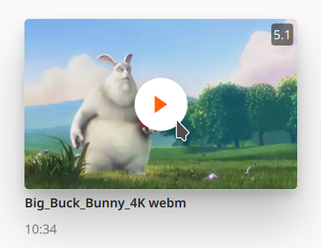
GridItem
A GridItem allow to present an item (a media, a note, etc…) in a grid view or in an horizontally scrollable view. It allows the user to have a quick summary of the essential information of the item,
it usually contains:
a picture allowing to identify the media, or the type of media
a title
eventually a subtitle containing secondary information (movie duration, album artist, media MRL, …)
it may also contain:
A progress indicator for media that are resumable
badges giving information on the media (resolution, audio channels, etc…)
an overlay to display context specific information or action (play button)
GridItem uses the class Widgets.GridItem